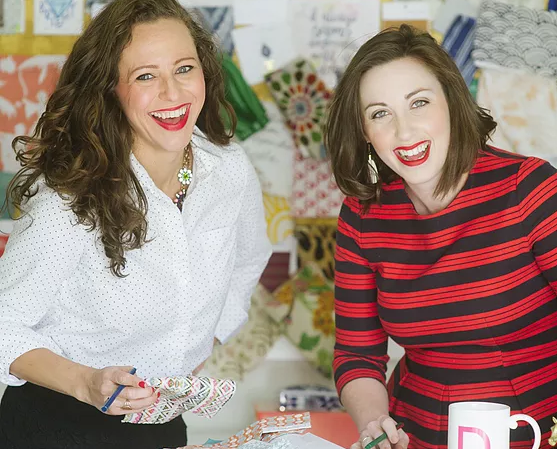
Meet the Ladies of GordonDunning, who’ve got some Boom Pow Energy
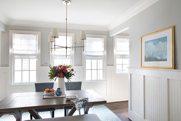
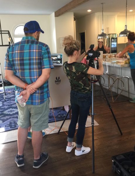
The shoot was a huge success where we not only shot gorgeous photos but we also got a glimpse into the process of creating a spectacular space. Over the next couple of weeks, with guidance from Lathem and Cate, we will dissect a handful of rooms we photographed and unpack the elements of design that take it from just a room to a space that inspires.

HH: Tell us the story of GordonDunning.
Lathem: We met at another firm, and left there to go to a different firm together, and left that firm to start our own thing. Essentially, when they paired us together at the first firm, that was it. It was love! We started GordonDunning in 2014.
HH: How would you describe your aesthetic?
Cate: There is an undercurrent of “fresh traditional” throughout our designs. There’s a lot of light, a good bit of color. Not necessarily bright color, but a lot of underlying neutral palettes and a lot of white. Our personal style is more eclectic, with antique pieces meshed with modern.
Lathem: Maybe a traditional/southern mix with a British floral component. We joke and call it “Grandma injected with color.” Color but with a breath of fresh air. A lot of antiques, stories, pieces from people’s families, which are often southern in our neck of the woods. We pair those with some bright, new things to make it what Cate describes as “fresh traditional.”
Cate: Yeah, like the guy from the Six Flags commercial, the old guy who dances. He’s classic. He’s rooted in history, but he’s got some boom-pow energy.
HH: How do you deal with color and getting people over the fear of expanding their palate or changing it up?

Cate: The color choices need to be intentional. We get to that point with our clients’ likes and dislikes through conversation and through a game we call “Love, Hate” where we give them a bunch of items to cast their opinions upon and that helps steer the design process.
Lathem: I feel like blue and green show up in most things that we do because they’re so in tune with nature and people don’t typically tire of those. Then you punch them with something like an orange or a purple or something bright. Surprise colors are easier to incorporate when they are easy-to-remove items. Color is worth the risk because it’s what makes a statement and makes a space interesting.
HH: For the Woodgrain photo shoot, was it difficult to make moulding the focal point?
Lathem: In some spaces, moulding is the perfect supporting actress. When you switch her to the lead actress, how do you alter things so that she comes through clearly without being an afterthought? Even though the reason she’s an afterthought is because the moulding works so perfectly. This photo shoot made us think creatively, which is why we love our job because no two days are the same.

Cate: Our clients are starting to notice the architecture of homes and the importance of details—and moulding is key to creating a finished space. They always notice when it’s not there, like when you get to your house and there are pillows and sofas but something is off. It’s the moulding. It’s the architectural details and finishings that really take the room to the next level.
HH: Speaking of the photo shoot, tell us a little about Sarah Dorio, who captured your designs so perfectly and why you are such huge fans of her work.
Lathem: She’s magical. She’s a photographic fairy genius. How do we sum up Sarah Dorio?

Cate: I think Sarah captures light and by doing that in interiors, she captures details that you can usually only experience when seeing a room. Somehow, in her layering and her light she catches detail and moulding in particular.
Lathem: Like Cate said, in her ability to capture light, she is able to transport you into that space and help you truly experience it.
Stay tuned for our next post with expert tips and tricks to creating a beautiful space with GordonDunning!