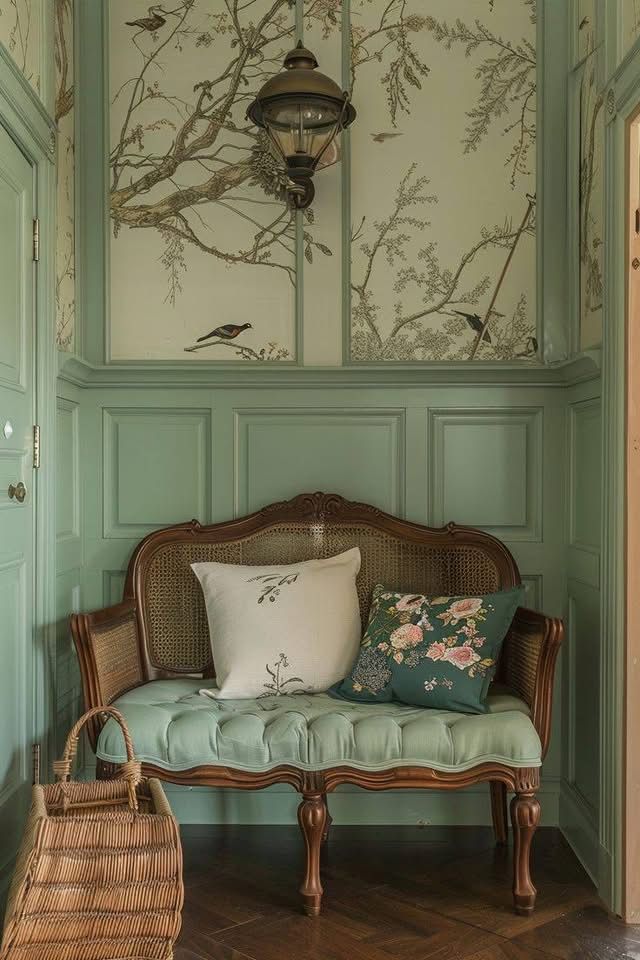
Pattern Drenching
In interior design, patterns have always been a defining element, bringing depth, dimension, and personality to every space. In recent years, however, designers and homeowners alike have taken that love of pattern one step further with a daring approach known as pattern drenching. Rather than using prints as accents or subtle flourishes, this trend fully immerses a space in one cohesive pattern, covering walls, upholstery, flooring, and even decorative accessories.
The result is a visually striking, deeply immersive environment that feels confident, curated, and utterly unique. Pattern drenching is not just about being bold; it is about creating harmony and storytelling through repetition and texture. If you are ready to transform your home with this captivating trend, here is everything you need to know.
Choosing the Right Pattern
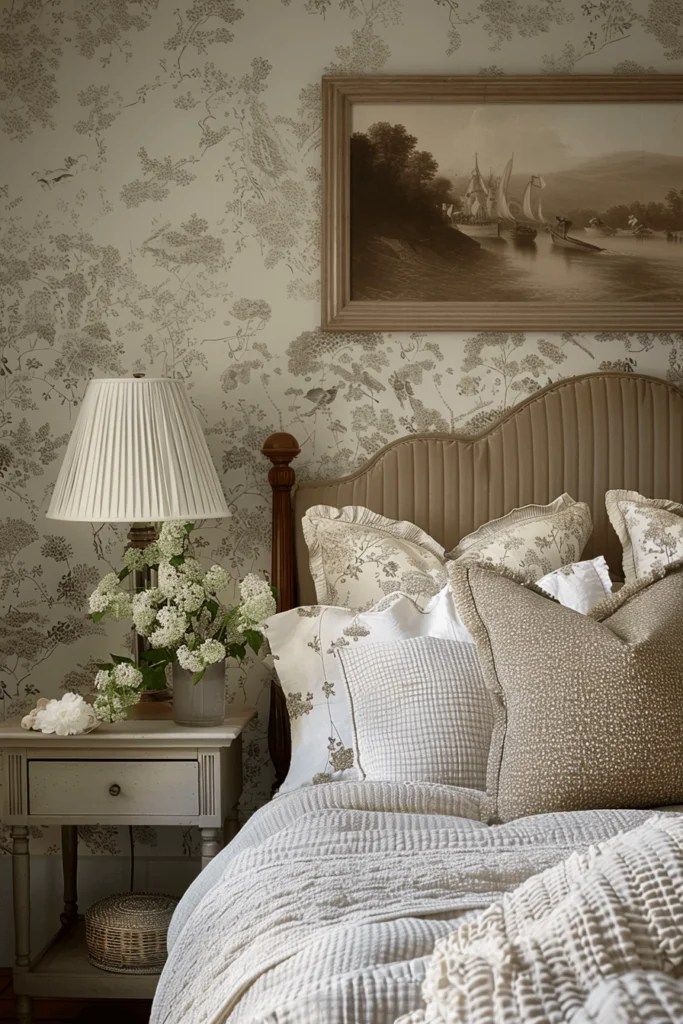
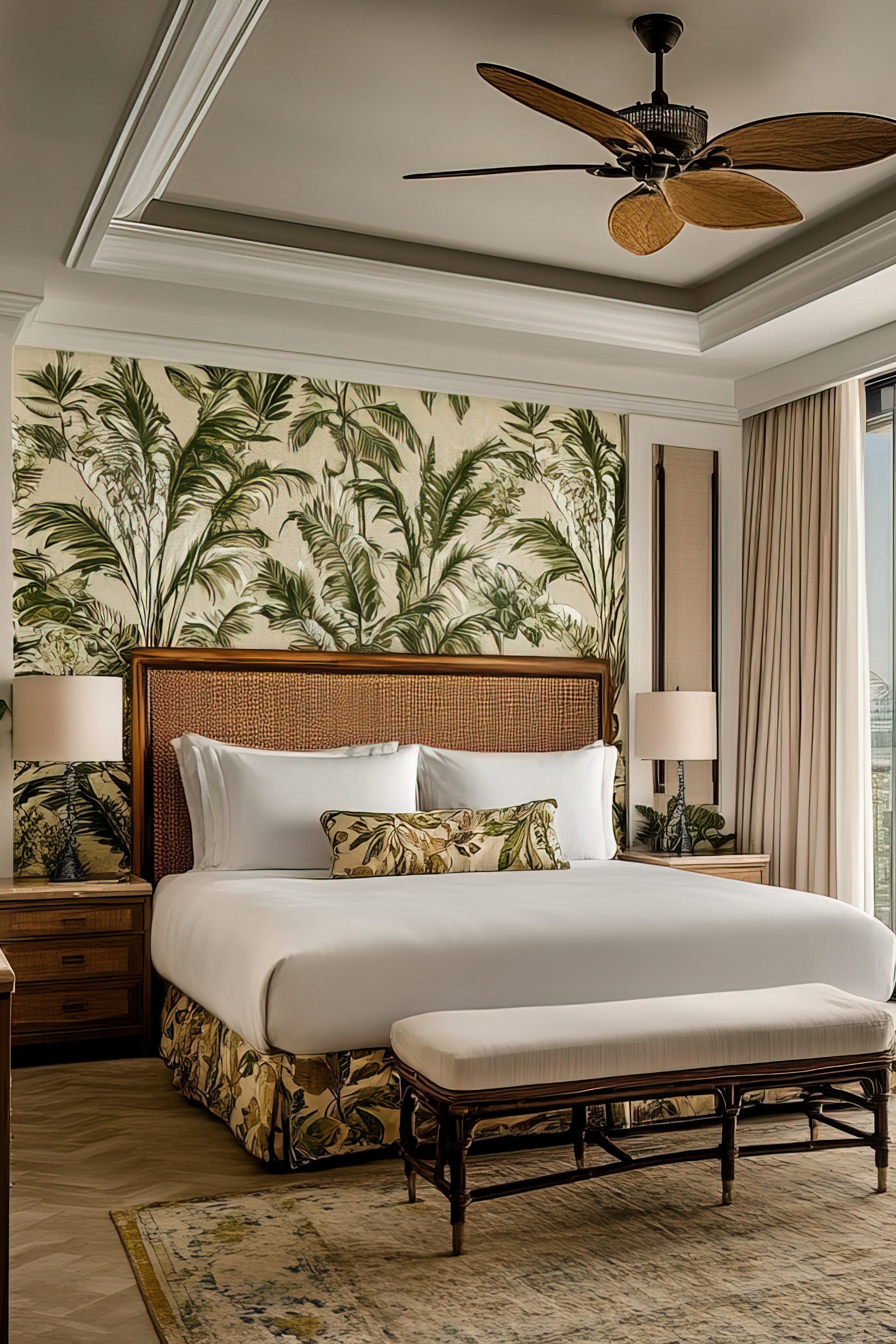
The foundation of successful pattern drenching begins with selecting the right print for your space. Think of your pattern as the voice of the room; it sets the tone for the entire atmosphere. Large-scale prints make a dramatic impact and are perfect for areas meant to energize and impress, such as living rooms, dining areas, or entryways. Smaller, more intricate motifs bring a sense of intimacy and refinement, making them ideal for bedrooms, offices, or cozy reading nooks.
It is also important to consider proportion. Oversized patterns in a smaller room can feel overwhelming, while smaller, repeating designs help maintain balance and flow. A beautiful trick many designers use is mixing variations of the same pattern. For example, pairing a floral wallpaper with matching upholstery in a slightly different scale adds sophistication and movement while keeping the overall look cohesive.

Playing with Color
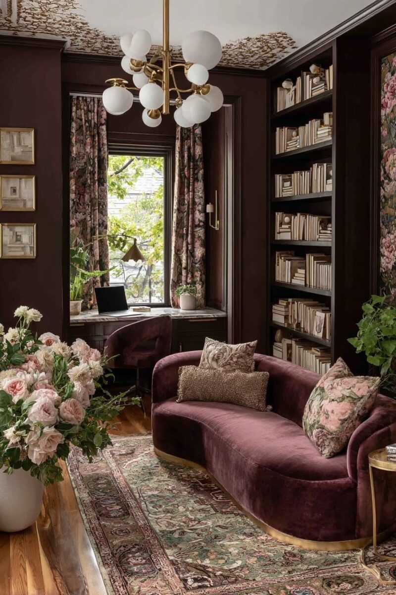
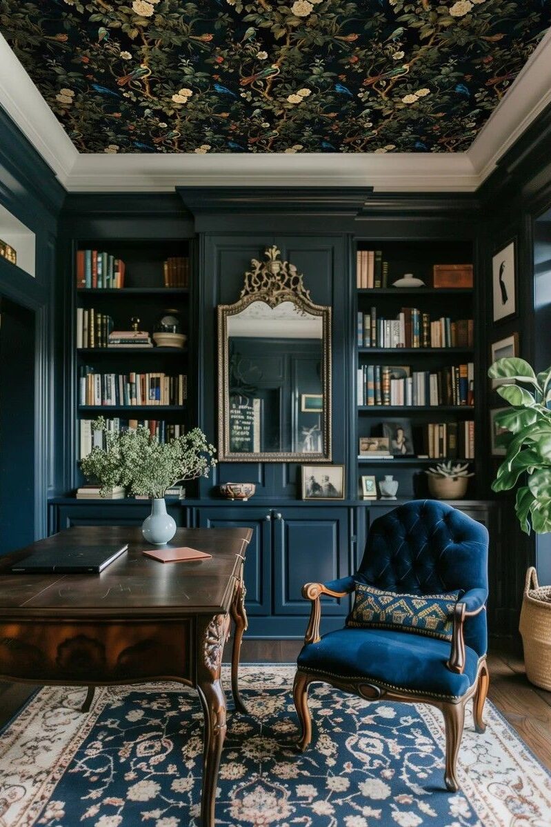
Color is the heartbeat of any pattern-drenched space, setting the tone for how it feels the moment you step inside. While soft, monochromatic schemes lend a sense of calm and cohesion, there’s something undeniably captivating about embracing richer, more saturated hues. Finding the right color is key; it should not only complement your patterns but also reflect the mood you want the room to evoke. Deep, saturated colors have a way of transforming a space, wrapping it in warmth and depth that feels both timeless and intentional.
Jewel tones such as sapphire blue, emerald green, and garnet red bring sophistication and richness, especially when layered with warm wood tones or metallic accents that add a soft, luminous touch. For a dramatic yet inviting look, balance these deeper shades with tactile finishes and small variations in tone. A navy backdrop, for example, can feel classic and grounding when paired with velvet upholstery or dark floral patterns, while accents in burnt orange or ochre introduce a welcoming vibrancy. In spaces such as libraries, bedrooms, or studies, this interplay of color and texture creates an atmosphere that feels cozy, elegant, and full of character.

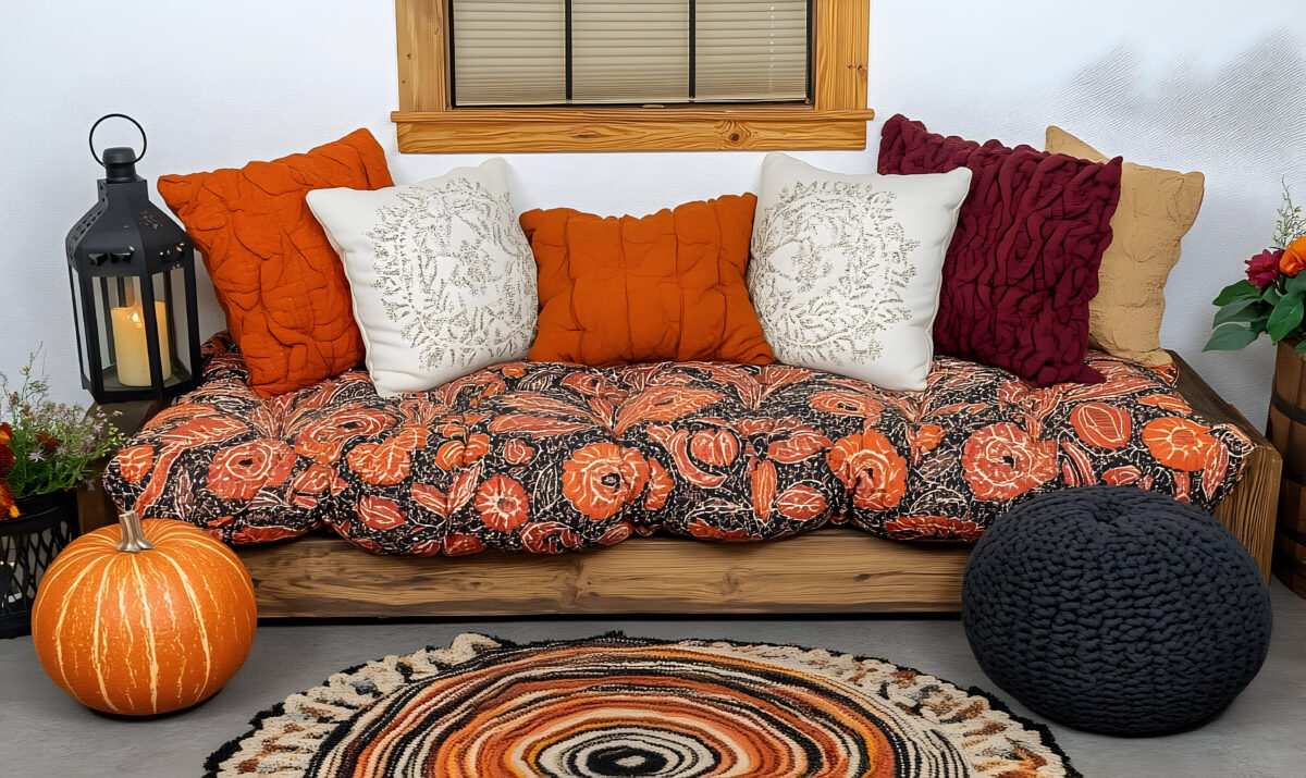
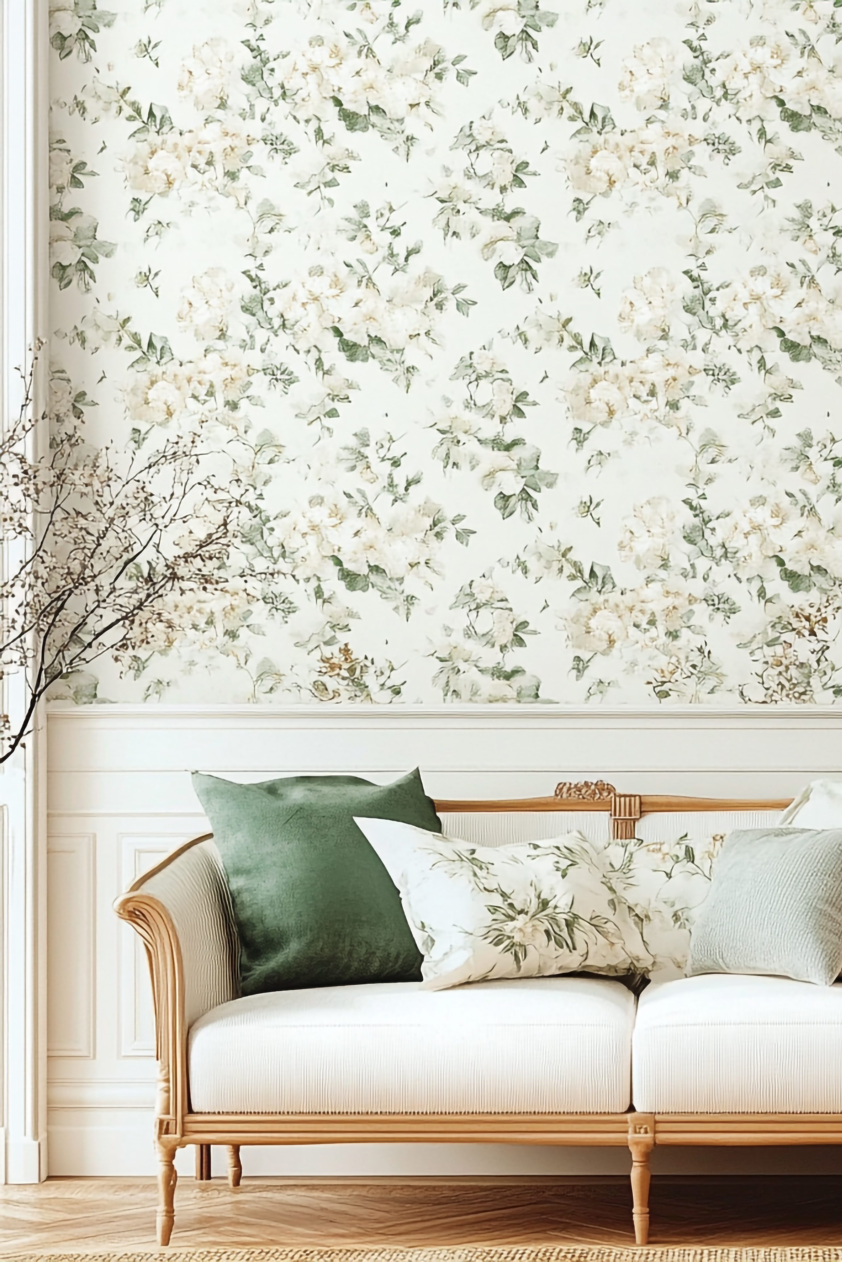
Layering Textures for Depth
A pattern-drenched space can easily tip from bold to overwhelming if every surface feels the same. That’s where texture becomes essential, adding balance, warmth, and dimension to the design. Incorporating a mix of materials such as velvet, linen, boucle, and natural wood introduces a tactile richness that invites touch and visual interest. Imagine a room wrapped in a leafy botanical print: the wallpaper sets the tone, a velvet sofa anchors the palette, and soft woven cushions add comfort and contrast. The interplay between smooth, soft, and organic textures creates a dynamic rhythm that keeps the eye engaged without feeling chaotic.
You can also experiment with contrasting finishes within the same pattern. For instance, pairing a subtle glossy wallpaper with a matte fabric in the same motif draws attention to light and shadow, adding quiet sophistication. Integrating natural materials like rattan, jute, or polished stone breaks up the repetition, giving the room a grounded and organic feel. Ultimately, layering texture within a patterned space ensures that the design feels intentional rather than excessive. It creates depth, harmony, and a sense of refinement that transforms a bold look into something truly livable and luxurious.

Balancing with Neutral Accents
Pattern drenching thrives on boldness, but strategically placed neutrals can ground the look and keep it livable. Solid-colored furniture, simple lighting fixtures, and minimalist décor can provide a sense of balance without detracting from the impact of the pattern. This approach allows the pattern to shine while ensuring the room remains inviting and livable. Incorporating neutral accessories, such as a plain area rug or understated window treatments, can help define different areas within a heavily patterned space.
Neutral elements also play a role in preventing visual fatigue. While an all-patterned space is immersive, having a few resting points for the eyes is crucial for maintaining comfort. Soft creams, beiges, or grays can subtly counterbalance the print-heavy surroundings, offering a sense of relief without disrupting the design narrative. The key is to find harmony between vibrancy and subtlety.
Wanna know how to create the perfect room with a balance between wallpaper and moulding? Check out our blog on the Perfect combination!
Coordinating Patterns Across Spaces
If you’re considering pattern drenching throughout multiple rooms, it’s important to create a sense of flow between spaces. While each room can have its own distinct pattern, ensuring they complement one another prevents the overall design from feeling disjointed. Sticking to a consistent color palette or repeating design motifs helps the entire home feel cohesive and intentional. For example, floral prints in one room can transition beautifully into abstract botanicals in another, creating a seamless visual experience.
Additionally, using a consistent design element, such as repeating a specific motif in different scales or color variations, can enhance unity. If you’re working with an open floor plan, consider using variations of the same pattern to distinguish spaces while still maintaining a connected look. Thoughtfully coordinating patterns across rooms allows for a bold yet harmonious result, making pattern drenching a truly immersive design experience.

While pattern drenching is a bold choice, it doesn’t have to be overwhelming. By carefully selecting your prints, balancing color and texture, and introducing neutral elements where needed, you can create a space that feels both exciting and well-designed. Start small with a single room or accent area, and let your confidence grow as you refine your aesthetic. The key is to approach the process with intention. Experimenting with samples, testing lighting conditions, and layering elements thoughtfully will help you achieve a space that feels curated rather than chaotic. When done right, pattern drenching has the power to elevate your home into a visually stunning retreat that reflects your personality. Whether you lean into a vibrant, maximalist look or prefer a more structured, tonal approach, this trend offers endless opportunities for creativity and self-expression. So go ahead, embrace the boldness, trust your instincts, and let your space tell a story that’s uniquely yours!
Check out our Pinterest Board for more inspirational designs and make sure to follow us on all of our social media platforms @WeAreWoodgrain