
Designing a Softer Fall Color Story
September has a quiet way of turning the season. The days may still hold late-summer warmth, but the light begins to soften and everyday routines settle back into place. Home starts to feel especially inviting at the end of the day, even before the leaves fully turn. It is the in-between season: not quite time for holiday décor, but a good time to bring in a little more warmth.
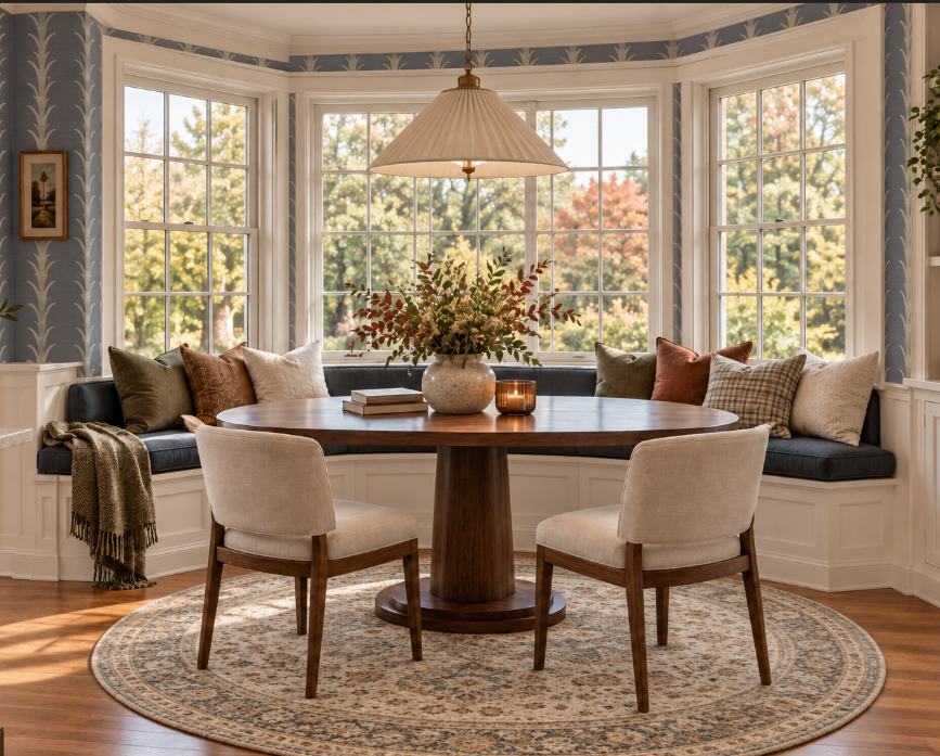
A softer start to fall can be as simple as shifting the colors already in your home. Warm cream, olive-toned sage, muted inky blue, tawny rust, and chocolate brown create a palette that feels comfortable and layered without looking overly seasonal. The goal is not to redecorate every room or buy a collection of new accessories. It is to choose colors that make the spaces you use every day feel more settled for the months ahead.
Think in Tones, Not Seasonal Décor
When fall decorating comes to mind, it is easy to picture pumpkins, bright orange accents, and pieces that only feel right for a few weeks. A color story takes a quieter approach. Rather than bringing the season in through obvious decorations, it lets the undertones of a room do the work. The result can feel warm and current without looking like a themed display.
Warm cream can soften a stark white wall or a crisp upholstered piece. A muted inky blue can add calm, while olive-toned sage brings a natural note that still feels fresh. Tawny rust adds a small amount of richness, and chocolate brown gives the palette depth. Together, these colors create a sense of fall without asking one shade to carry the entire room.
This approach is also practical because most of the palette can stay in place well beyond the season. A cream wall, an olive-sage door, or a piece of blue artwork can feel just as fitting in winter or spring. Smaller tawny-rust accents can be moved, changed, or layered in as your home evolves. That makes the room feel considered instead of decorated for a single date on the calendar.
Begin With a Warm Cream Foundation
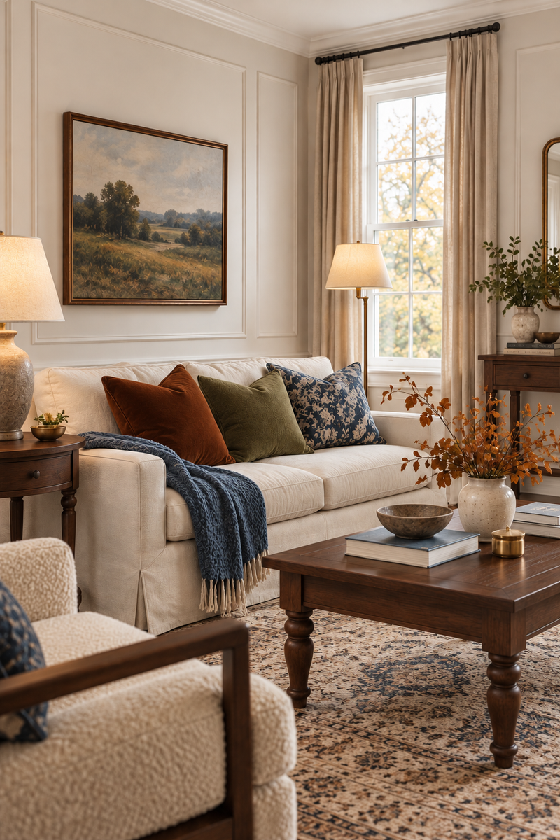
Warm cream is a helpful starting point because it keeps rooms light while giving them more softness than bright white. It works especially well in spaces that need a little warmth but do not have enough natural light to support a darker paint color. On the wall, it creates an easy backdrop for wood furniture, artwork, and a few carefully chosen accents. In the evening, it also picks up the glow of lamps in a way that feels relaxed rather than stark.
Look for a cream with a subtle oat, beige, or golden undertone instead of one that reads yellow. The right shade should still feel clean in daylight, then become warmer as the sun goes down. It can be used on walls, but it is just as effective in larger pieces such as curtains, bedding, upholstery, and area rugs. These softer layers make a room feel ready for fall without changing its overall style.
Cream gives the rest of this palette room to breathe. Tawny rust and chocolate brown feel inviting rather than heavy when they are paired with a lighter base. Muted inky blue and olive-toned sage also stand out more clearly against it, which means they can be used in smaller, meaningful ways. Starting with one warm neutral makes it easier to add color slowly and choose only the pieces that feel right for your home.
Use Muted Inky Blue and Olive-Toned Sage for Painted Details
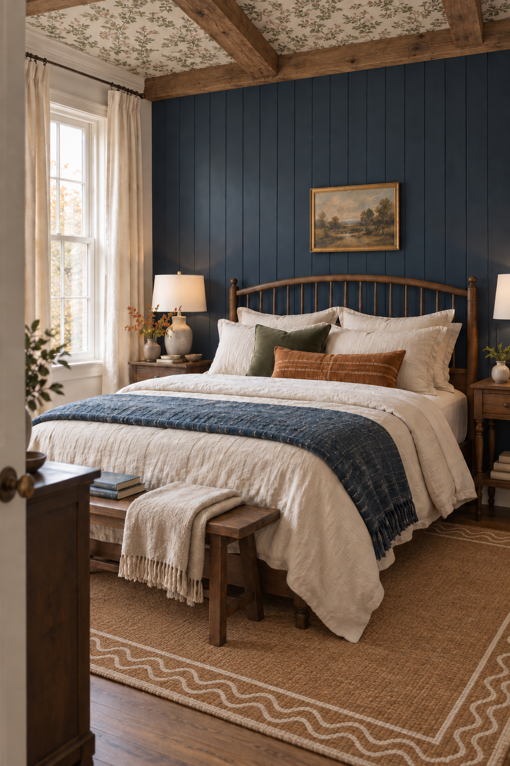
Muted inky blue is one of the easiest colors to introduce when you want a room to feel calm, but not plain. Think of softened navy, faded denim, or gentle slate rather than a bright coastal shade. These tones have enough depth to feel grounded, yet they keep the overall palette from becoming too dark. An inky-blue accent wall behind a bed, in a dining nook, or near a favorite chair can give a familiar room a fresh point of view.
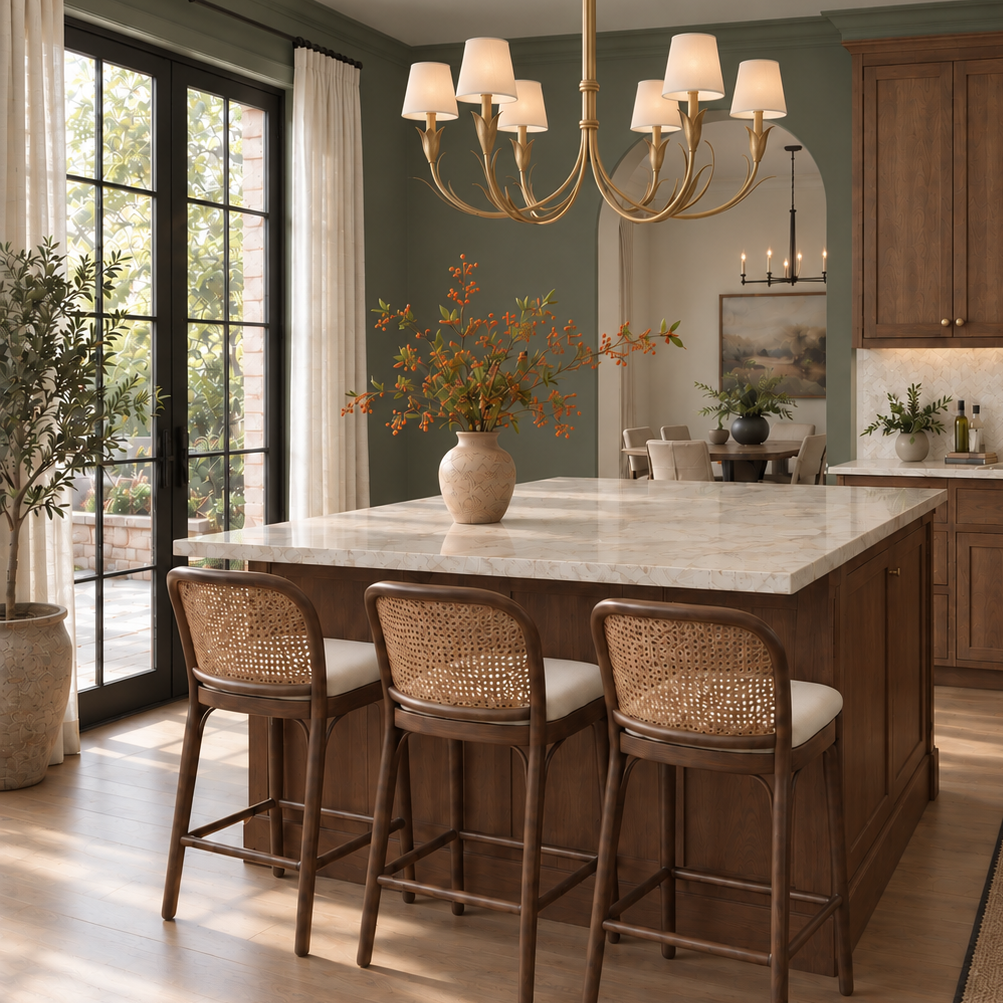
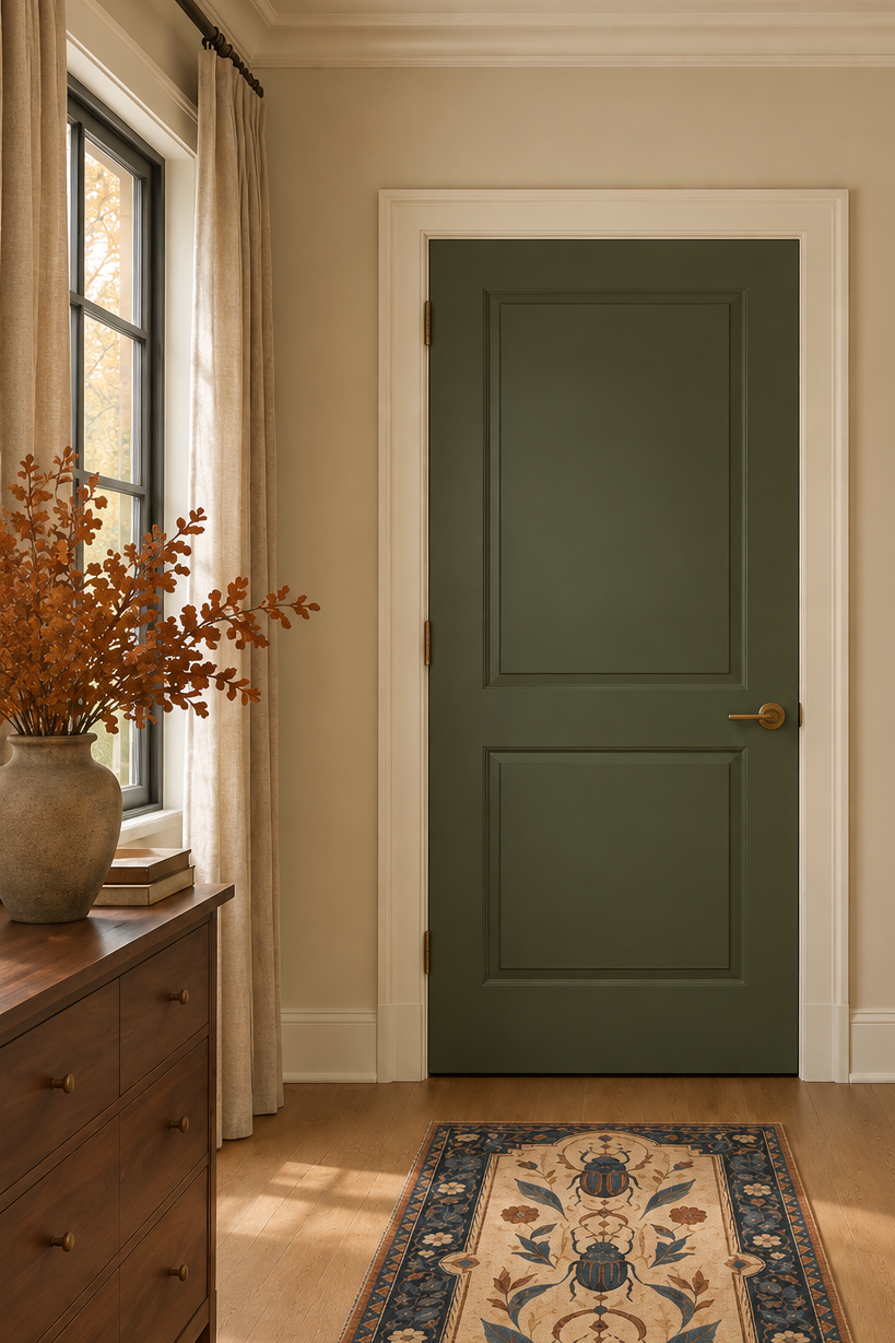
Olive-toned sage works in a similar way, but it brings a little more depth than a pale green. A softened, grayed olive can make an entryway, powder room, laundry room, or hallway feel more finished without making the walls feel busy. It also pairs naturally with warm cream, chocolate brown, and tawny-rust artwork. When a room already has several neutral pieces, olive-toned sage can be the quiet color that makes them feel connected.
Painted details are a thoughtful place to use both colors. An inky-blue or olive-sage interior door can add personality at the end of a hallway, while softly contrasting trim or moulding can give a smaller room more definition. For more ways a door can support the room around it, explore interior door styles that add character. Rather than sitting on top of the room like a seasonal accessory, these choices become part of its everyday design.
Trim and moulding deserve the same consideration as the color itself. A simple flat baseboard or thin casing can keep a small hallway feeling open, while panel moulding or picture-frame details can give a dining nook or entryway a more tailored presence. Fluted and reeded millwork can add another layer of texture, while a more layered crown profile can take the room in a heritage-inspired direction, especially when trim and walls are painted in the same shade. If you are deciding what might suit your room, explore moulding profiles that can help frame a space.
Add Tawny Rust With Décor and Wall Art
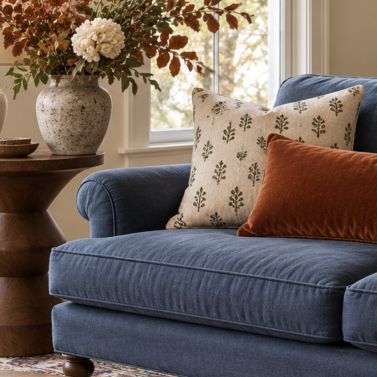
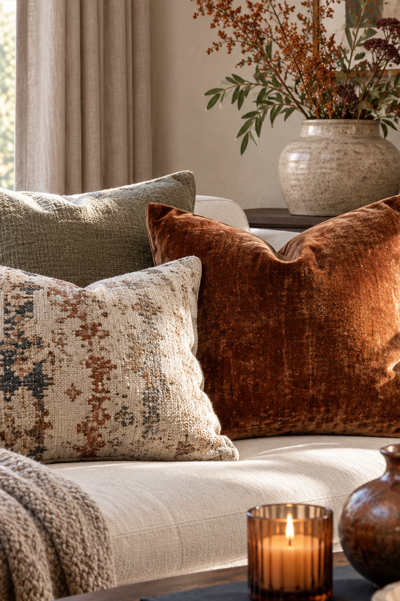
Tawny rust is the warmest color in this story, so it works best in smaller, more flexible layers. A rust-toned pillow, ceramic vase, throw, or lampshade can bring a room to life without changing its foundation. It is a gentler way to acknowledge the coming season than reaching for bright orange or heavily themed décor. A little is often enough, especially when the room already includes cream, inky blue, or olive-toned sage.
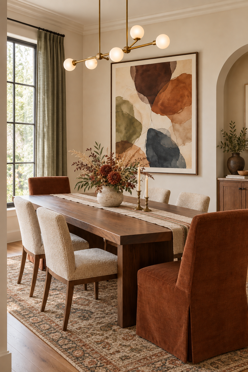
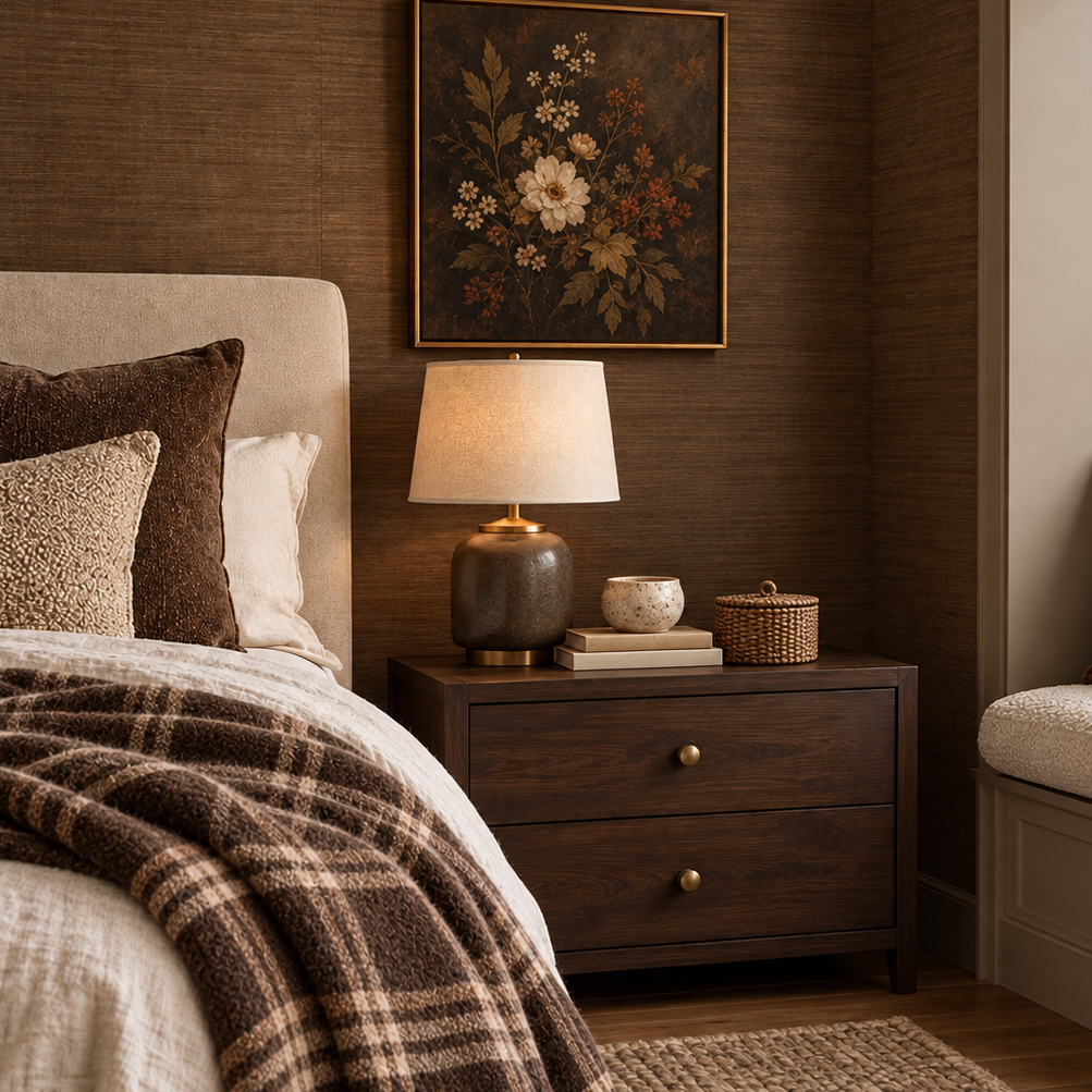
Wall art is one of the easiest ways to bring the palette together. Look for artwork that combines inky blue, olive, cream, brown, and a touch of tawny rust in one piece. That gives the eye a clear color story without requiring several unrelated accessories around the room. A simple frame in warm wood or a dark chocolate finish can make the colors feel even more established.
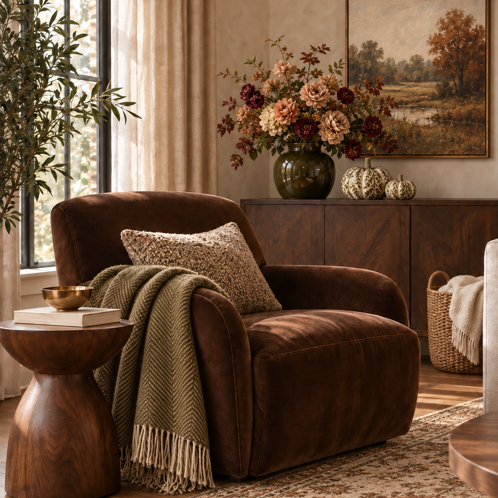
Tawny rust does not need to be the first thing you notice in a room. It is most effective when it appears as a small surprise beside calmer colors and natural materials. A warm-toned print over a cream sofa or a rust pillow on an olive-sage chair can add the right amount of contrast. By keeping it in art and décor, you can refresh the room over time without needing to repaint or replace larger pieces.
Ground the Palette With Chocolate Brown and Texture
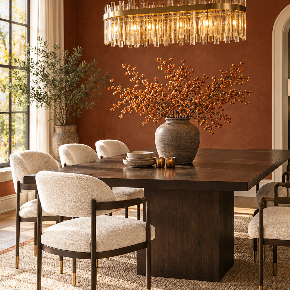
Chocolate brown is what gives this softer palette a little more structure. Darker wood furniture, woven baskets, leather, picture frames, and natural-fiber rugs add depth while keeping the room approachable. The beauty is in the variation, from medium walnut and dark oak to cane, rattan, and woven seagrass. These materials do not have to match perfectly to feel at home together.
Texture matters just as much as color when a room begins to shift toward fall. Linen curtains, a nubby throw, a wool rug, a woven runner, or a hand-finished ceramic piece can make even a quiet palette feel layered. These are the details that create comfort without filling a room with extra things. They also help inky blue, olive-toned sage, and cream feel warm enough for the season.
Lasting details can help carry this feeling, too. A chocolate-brown interior door, thoughtful moulding, or a dark finish that brings contrast to a cream wall can keep the room from feeling temporary. If you are still deciding which finishes and furniture styles feel most natural in your home, this guide to choosing furniture for your interior style can help you begin with pieces you already enjoy. The best color decisions usually grow from what you already love, rather than asking you to start from scratch.
Carry the Color Story Through the Home
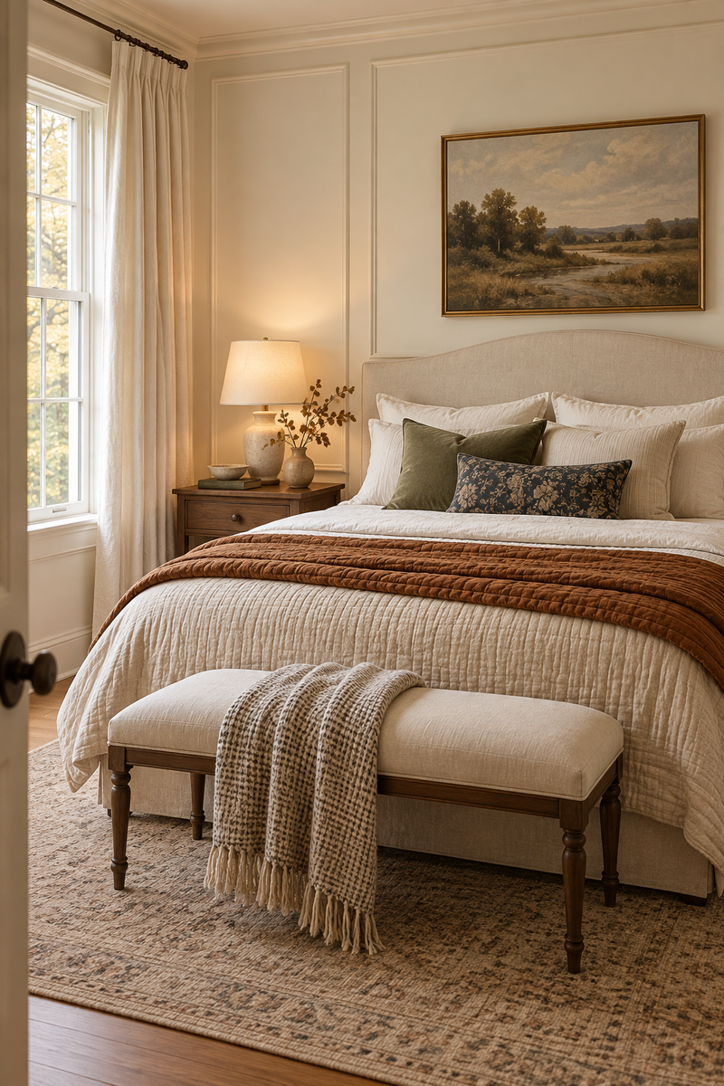
You do not need to use every color in every room. A home feels more relaxed when each space has its own version of the palette. In a living room, warm cream and chocolate-brown wood might lead while inky blue and tawny rust appear through art and textiles. In a bedroom, an inky-blue wall or headboard may be enough, with cream bedding and an olive-toned throw to complete the look.
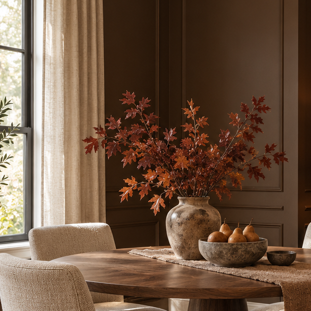
An entryway can be another natural place to try a little more color. Keep the walls light, then use an inky-blue or olive-sage interior door as a welcome point of interest. A natural wood console, a small lamp, and artwork with a touch of tawny rust can make the first view into the home feel warm and personal. In a dining area, the same colors can appear more quietly through linen napkins, seat cushions, a framed print, or a simple centerpiece.
The colors do not have to match exactly from room to room. What matters is that they share a softened quality and feel good beside the pieces already in your home. Start with one wall, one painted detail, or one piece of art, then notice what the room needs next. As August gives way to fall, those small changes can make home feel ready for the slower days ahead.
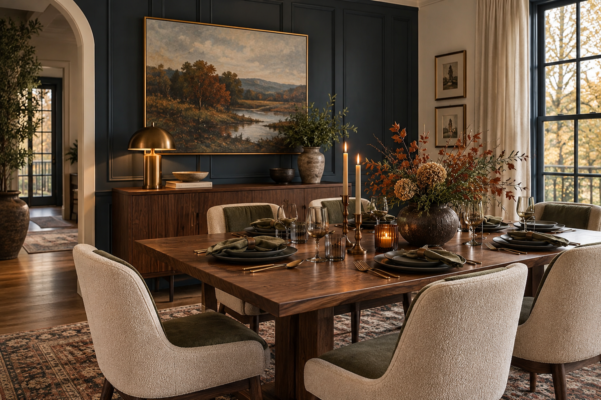
The best seasonal updates are often the ones that still feel right once the calendar moves on. A warmer throw, a fresh piece of art, a paint color you have been considering, or a wood detail that gives a room more depth can be enough to change the feeling of home. There is no need to rush into a full seasonal look. Start with the colors and materials that already make you feel comfortable, then add one softer, warmer layer at a time.
Fall often arrives in the home through the smallest changes. A room may feel different once a lamp is moved into a dim corner, a cream blanket replaces a lighter summer layer, or a favorite piece of art is given a new place to shine. Those choices are not dramatic, but they can make a space feel more useful and welcoming. They also leave room for the home to stay personal instead of looking styled for a season.
When color supports the way you live, it has a longer life than a passing trend. Warm cream, muted inky blue, olive-toned sage, tawny rust, and chocolate brown are flexible enough to return in different rooms and different forms over time. Let the palette build gradually, with pieces that have a place in your home beyond September. The finished space should feel like an easy transition into fall, not a complete departure from the home you already love.
Check out our Pinterest Board for more inspirational designs and make sure to follow us on all of our social media platforms @WeAreWoodgrain